

The Top 10 Presentation Design Pet Peeves Countdown!
Part 1: Peeves 10, 9 and 8
My name is John Polk. I built the presentation training for Capital One University taught to over 10,000 associates. I now lead John Polk & Associates that offers workshops, coaching, and presentation toolkits to improve the effectiveness and efficiency of your presentations. I give leaders the tools to create and deliver presentations that engage, influence, and drive action.
I start every Presentations That Drive Action workshop by asking participants about their presentation pet peeves and best practices. A typical Zoom Annotate session looks like this (without even being able to read the detail, you can clearly see that there’s a LOT of pet peeves out there!):
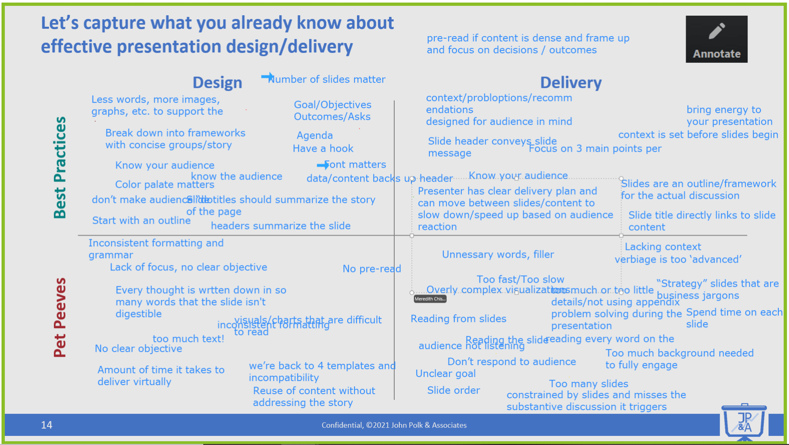
Often the pet peeves are simply the opposite of the best practices. But asking for pet peeves lets the PowerPoint haters get it out of their system!
In this blog series, I will share the top 10 design pet peeves, taken from a sample of over 1,000 students, listed from lowest to highest frequency. Each pet peeve generates noise that interferes with your signal and increases the cognitive load required to digest your material. You will recognize these pet peeves in the presentations you’ve sat through. How many are you making your audiences sit through? Let’s reveal 10, 9 and 8!
10. Bad or too many colors
There are many ways that color can cause problems for your slides. Using too many colors is distracting. Arbitrary color choices mean your audience is looking for meaning where there isn’t. Bright/neon colors grab attention, causing distraction. In one of my workshop exercises, I show the “before” version of a graph. The noisy element that gets the most visceral reaction is a thick, neon red border. One participant said, “That border is literally giving me a headache.”
To ensure color helps your communication:
- Use the same color for common elements.
See Pet Peeve #2. - Align color choices with meaning.
Don’t use red unless you want your audience to think, “This is important” or “This project is off track.” - Use a simple color palette.
Choose one or two colors for standard template elements. I like to use a primary dark color, like blue, and a secondary light color, like gray. Color palette generators like Adobe Color Palette or Coolors make it easy to create a color palette compatible with your core brand colors.
9. Typos
Coming back from lunch during one of my workshops, I noticed I had misspelled a word on a flipchart at the beginning of the session. I asked the group how many people noticed, and half the participants raised their hands. I asked, “And what did you think?” A guy in the back of the room said, “I thought you were an idiot.” Not exactly the first impression I’d hoped to make. Even if your audience doesn’t think you are an idiot, typos leave the impression that you are sloppy, and then your audience will question your spreadsheet or your recommendations.
To avoid typos:
- Read your text out loud.
Reading will slow you down and help catch issues. - Use grammar checking tools.
Always spell-check your work as the last step, and use tools like ProWritingAid or Grammarly to catch issues built-in spell-checkers don’t. - Have someone else proofread your work. Unfortunately, no grammar checker is perfect, and you are too close to the material to catch the typo you’ve skipped over for weeks.
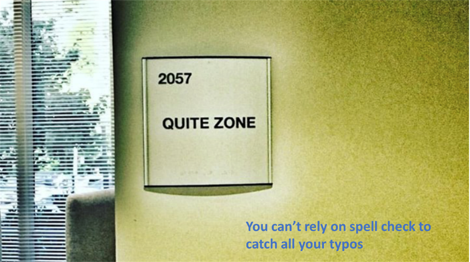
Photo by Eric Bowers
8. Too many fonts
By setting standard font sizes for titles, bullets, and text boxes, you can minimize distractions that make your presentation look unprofessional. “Simple, clean design” came in 3rd for best practices, which applies to many pet peeves on this list. “Readable font” came in 9th, so skip the comic sans font for something that is accessible to everyone.
To simplify your fonts:
- Set consistent font types and sizes in the slide master.
See Pet Peeve #2. - Choose one font type.
Many templates and style guides recommend using different font types for title blocks vs. text. While this can help your audience distinguish the two, it creates a massive standardization challenge. Besides, font size and color do a fine job differentiating titles vs. text. - Use software tools to eliminate non-standard fonts.
In PowerPoint, “Format/Replace Fonts” can find and replace fonts across all pages. The “Format Painter” lets you copy formats, including fonts, from one element to another.
So that’s the first three in this count down. Is your pet peeve one of these? Is this something you can improve? The good news is that these are not too hard to fix! But, what are the other seven you may be wondering? Stay tuned for the next post in this series where I continue the count down with pet peeve 7, 6 and 5!
