
Show me the numbers sounds clichéd, but numbers are what a data-oriented society expects. For designers and content professionals, this expectation comes with an additional challenge to represent the data in an impactful way.
Neuroscience researchers assert that the brain reflexively avoids complex images by rejecting them in a few seconds. Finding ways to captivate audience attention in a world of ever-increasing distractions is difficult enough. Making your data captivating might appear next to impossible.
But are these challenges insurmountable? They don’t have to be.
Making data simple is not so simple. Making data visually appealing can lead to misunderstandings. Data is not only about numbers but the meaning behind those numbers—their story. The solution, then, is to tell the right story about the data and guide the audience’s understanding of it. This leads to a shared interpretation.
In September, Nancy Duarte—CEO of Duarte, Inc. and Guild Advisor—will publish her next book DataStory: Explain Data and Inspire Action Through Story. The Presentation Guild interviewed her about how to be accurate in the creative process of data storytelling:
“Access to data is vast. The bigger data gets, the more complicated forms of interactive visualizations are at our disposal. When it comes to communicating data, you want to choose the charts that make the insights from the data the clearest, not the coolest. After you plot the chart, highlight what’s important and overlay annotations to show what your conclusions are from the data.”
Nancy wants designers to keep in mind that “data is finite and factual and should be visually represented as such.” She doesn’t like applying creative expression to data unless it enhances clarity or “builds important context for what you’re trying to convey.”
Through her new book, Nancy shows content professionals how to move from “numbers into narratives.” This will enable them to explain data in a way that drives action in their audience.
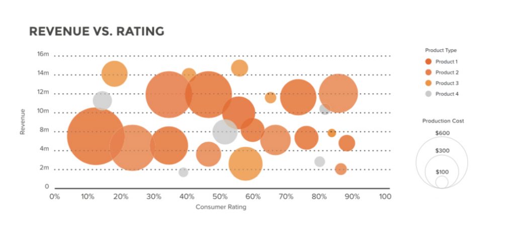
Moving numbers into narratives reminds us of the first rule when creating content and design—know your audience. Does your audience have the right background to instantly recognize the message and process it? We ran a small experiment at my company Mediapool with three different groups. Were they able to interpret scatter plots and bubble charts in less than 30 seconds?
First group: 22 sales managers. They could see a movement but focused only on the higher result, they were not able to compare families in a few seconds.
Second group: 13 startups C-level. They gave the same results as the sales managers.
Third group: 9 high school students. They paid more attention to the fact that different families were represented. They were more focused on the “movement” but weren’t able to compare units sold by family.

The bubble chart was even more confusing to all test groups. This test wasn’t a scientific experiment, but a way to gauge feedback to understand how well these charts communicated data. In our jobs, we usually work with a team or our clients to determine which graphics or content works best and adjust the final product based on their feedback. In this specific situation, our content and image failed. If this graphic was created for a real project, we would need to redesign it.
The Guild asked Amy Cesal, Community Director at Data Visualization Society, to share her point of view about creating a meaningful experience in data presentations:
“You need to be able to answer the questions “why are you showing this to people” and “what do you want them to take away from it”. (…) Focusing on these kind of questions is especially important when trying to communicate complicated data through visualization as well. It’s also engaging to step through the data and use multiple slides or transitions to reveal things slowly. One chart, one message. One slide, one message. Anything more than that the audience needs to do a lot of cognitive work to understand the graph.
However, there are a lot of benefits to less traditional, more creative methods of visualization. I experimented with visualizing information with Play-Doh, and the project really resonated with people. A unique design has the ability to grab people’s attention the way a simple bar chart might not.”
As presentation professionals, we know that there is no single formula for communicating numbers and meanings. But how do we establish a dialogue with clients who are only now beginning to appreciate data visualization techniques as an effective tool to communicate?
Investing the time to create a really effective chart—especially if your company never had one before—can help stakeholders realize the value of good data design. As Amy noted, “You can’t expect people without much experience with data visualization to be able to imagine the value of data that hasn’t been viz-ed yet!”
Amy suggests subscribing to e-zines that include inspirational data visualization like Flowing Data by Nathan Yau and Fair Warning by Sophie Warnes. When you see what’s possible, then you can apply that inspiration to your own projects. She also suggests joining the Data Visualization Society, which she helped start. This organization is collecting resources and establishing best practices around data visualization to help mature the industry as a whole.
Some design professionals wonder what the future holds for our industry. Will we be supported or threatened by so many template companies that are popping around the world?
Amy believes that every tool has its strengths and limitations:
“I think templates are useful when creating a bunch of graphics and for maintaining consistency. I’ve even created a number of data visualization style guides to help create consistency among charts and graphs. But charts and graphs should look like a family of visuals not identical twins. It’s hard to see the uniqueness of the data and figure out the meaning of the chart if everything is visually identical.
Additionally, different tools have different uses and features. An organization or presenter might need to use several different ones depending on the data and analyses they are conducting. If we rely on only built-in templates, our outputs look like the tool that created. You can often spot an Excel or Tableau chart by sight. These tools are immensely useful, but the end goal should be to produce cohesive, branded visuals across the full suite of content produced by the organization, and this often requires more than built-in templates.
I also think there will always be a place for more bespoke data visualizations and designs, because something that’s unique is more engaging and grabs attention.”
With our professional certifications rolling out in October and establishing presentation standards, the Presentation Guild plans to raise the bar with best practices regarding presentation development and design. Helping you “show the numbers” and guiding audience to understanding is part of that plan.
What do you think? Share your opinions with us.
